York Montessori School
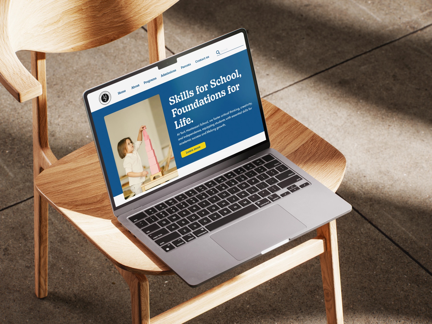
York Montessori School is an early education school in the Greater Toronto Area. Its enrollment was suffering from an outdated website that did not explain the Montessori approach.
I redesigned the site end to end: content, structure and visual tone, so parents can understand and trust the school in their first visit.
- Role
- Product Designer
- Team
- Solo project
- Timeline
- Fall 2024
The problem
Parents could not tell what the school stood for, so they did not trust it.
York Montessori School was losing enrollment to its own website. Outdated design and unclear messaging made it hard for parents to understand the Montessori philosophy, let alone trust the school with their child’s early education.
The question I set myself: how might we present Montessori values in a clear, approachable way that builds parent trust?
Insights
Parents decide with their gut first and their reading second.
Research into how parents choose early education kept pointing the same way. They want emotional reassurance as much as information, an instant read on school quality, and calm, easy navigation. Gerald Zaltman’s work at Harvard puts a number on it: 95% of purchasing decisions happen subconsciously.
Competitive analysis
Outdated competitors, untapped opportunity.
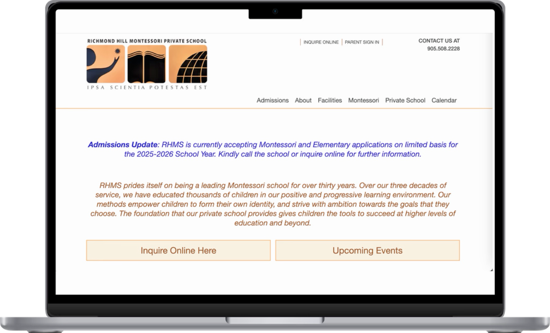
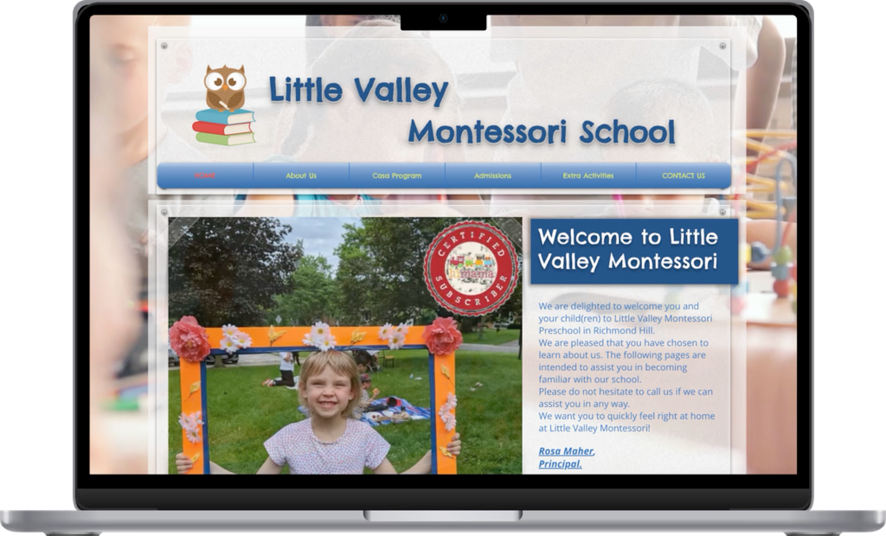
I looked at two local Montessori schools, one public and one private. Both had great reputations, but their websites felt outdated and hard to navigate. They did not showcase the schools’ quality or build the trust parents expect. Realizing how much modern parents rely on online research, I saw the gap: even excellent schools were losing their chance to make a strong first impression through design.
Structure
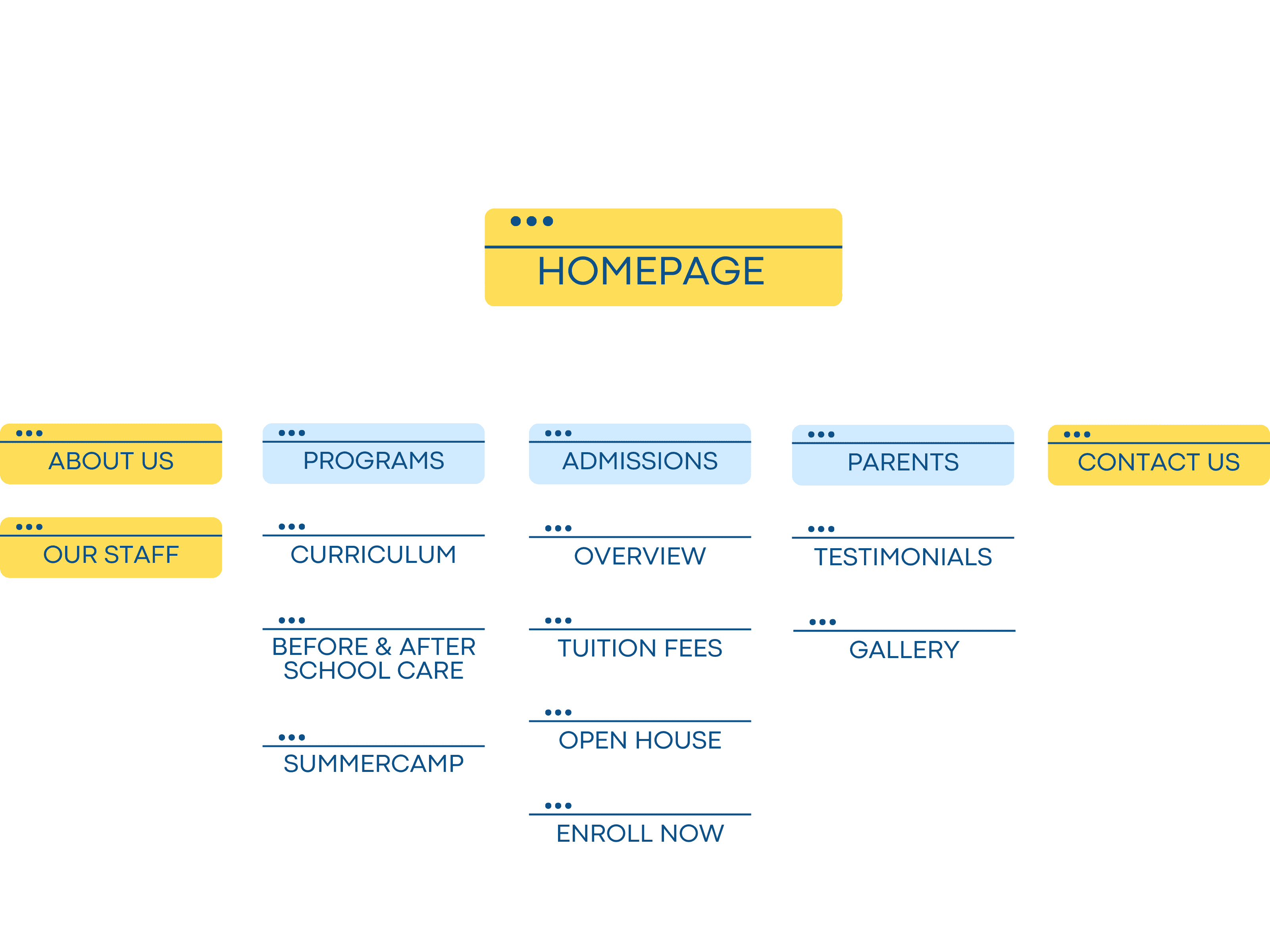
A sitemap that tells parents where to look.
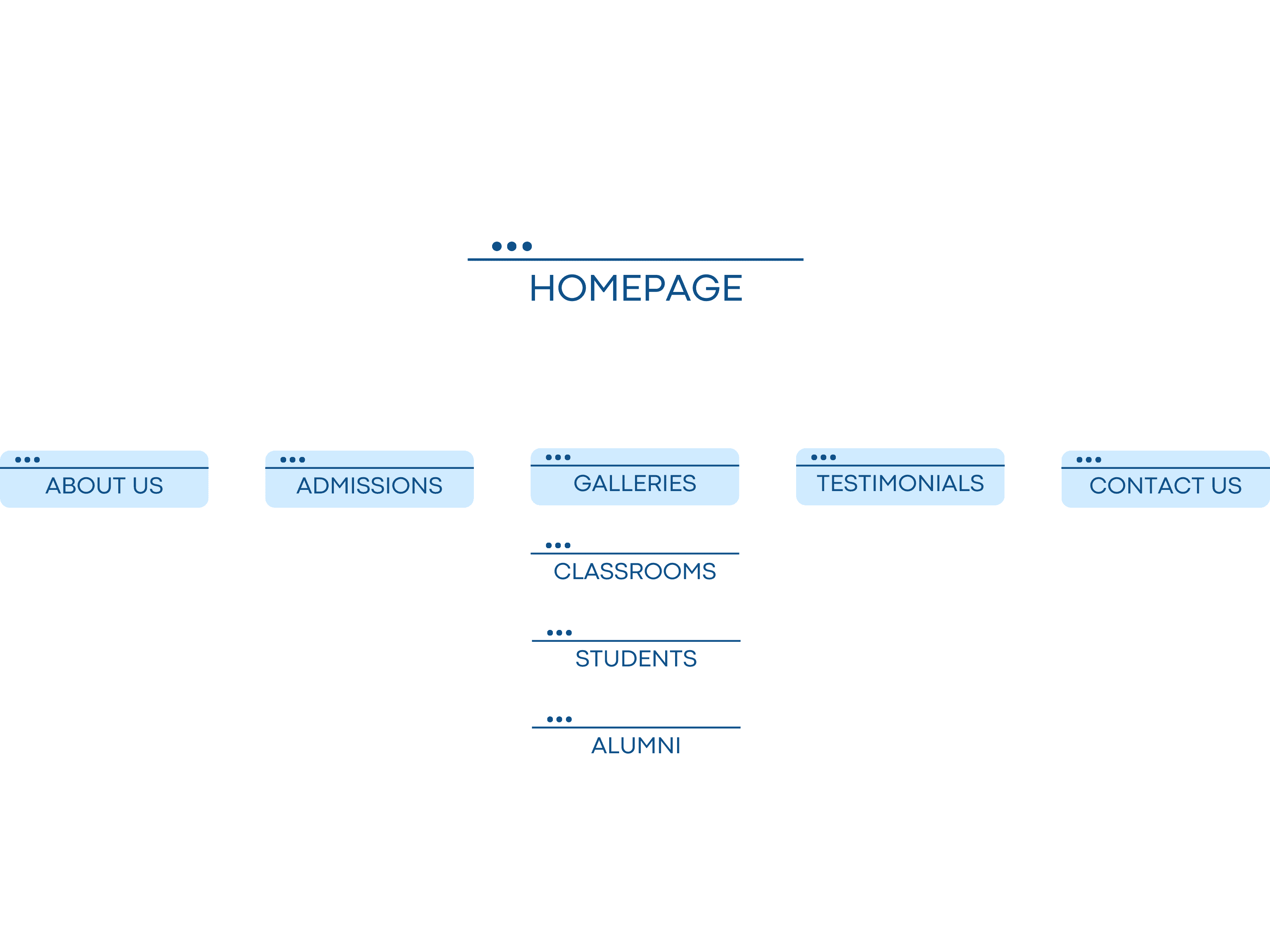
The old sitemap had no subpages, so key information was scattered across a few crowded screens. The new one breaks content into well-organised subpages so parents can find what they need and feel confident in what the school offers.
Solution
Clear content, visible community, a calmer tone.
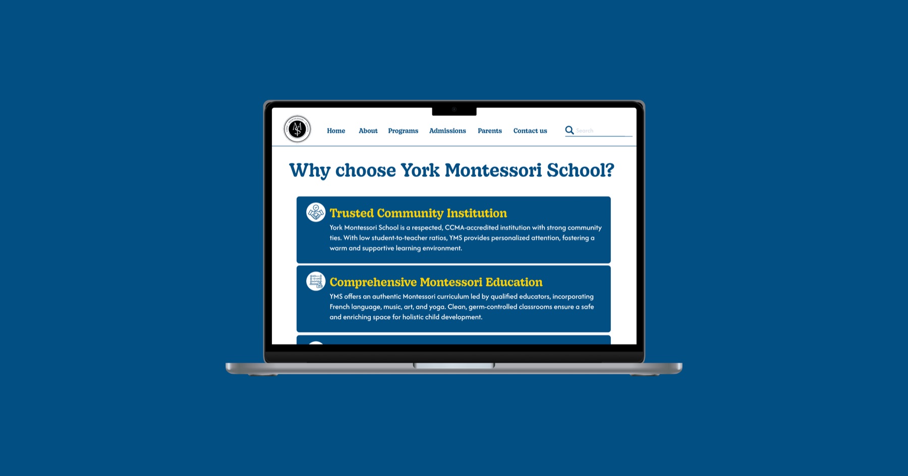
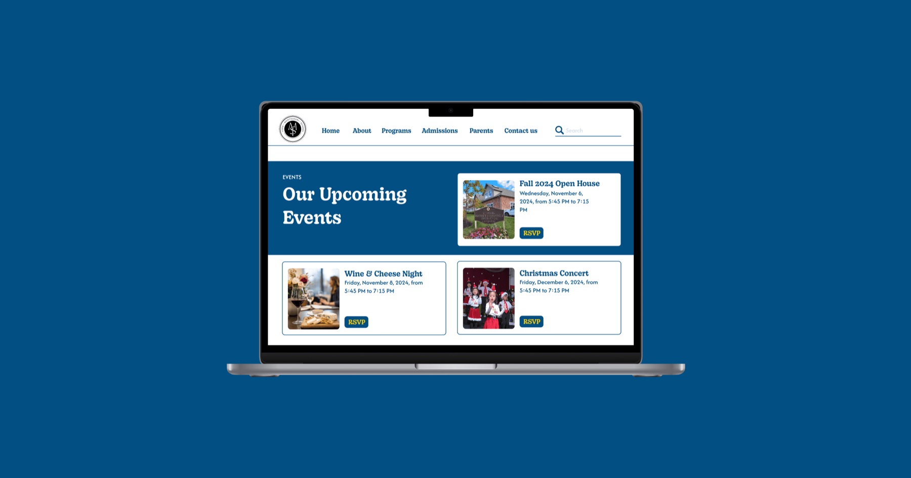
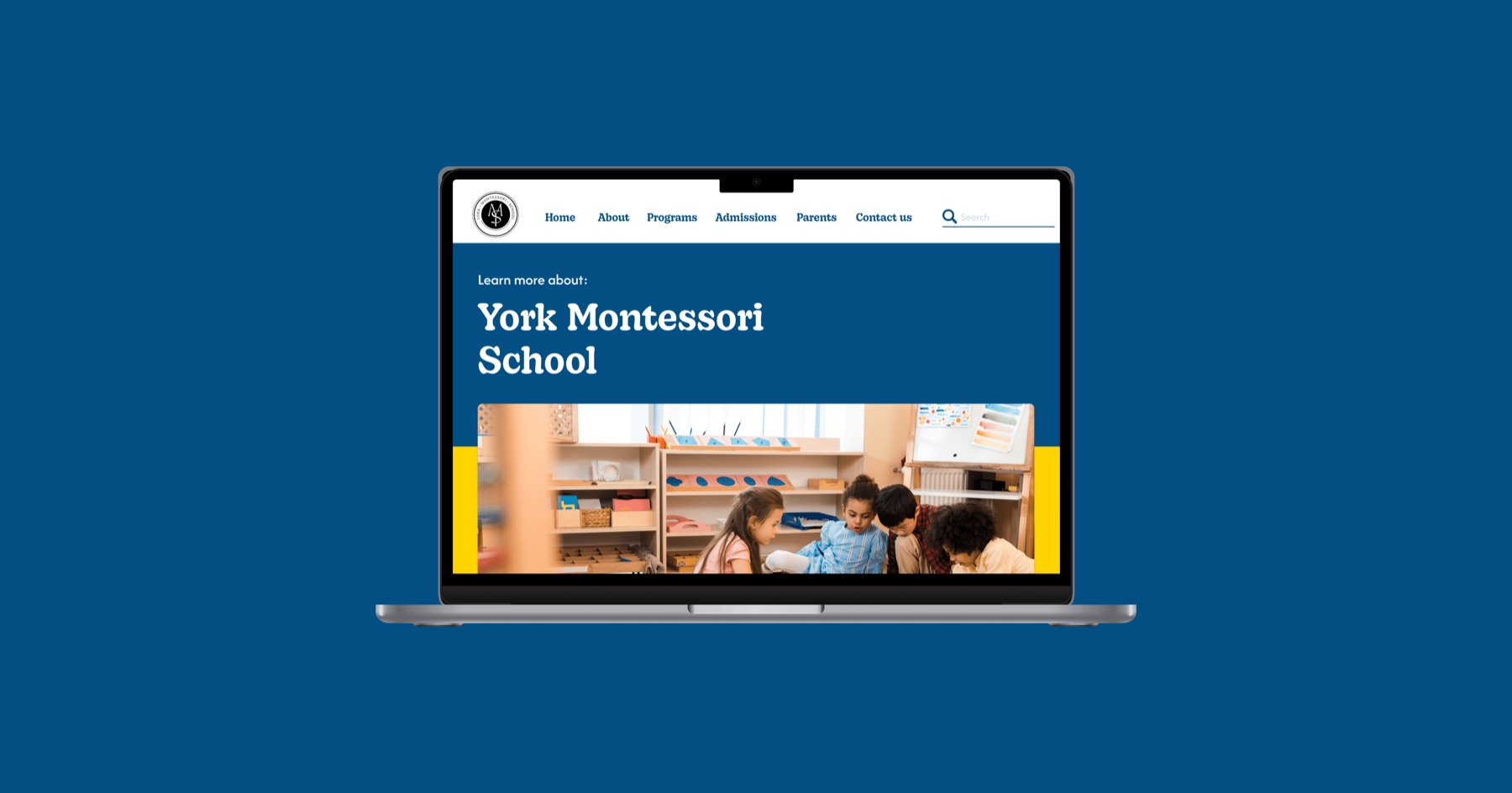
Reorganised the homepage and navigation so key information comes first and the Montessori philosophy is explained plainly. Real testimonials for credibility, community events to show engagement, FAQs and a newsletter to keep parents informed. A softer palette, warmth through imagery and icons, and balanced whitespace so the site feels welcoming rather than busy.
Reflection
I would test with real parents next time.
Feedback came mainly from peers and professors. Parents’ lived experience would have added depth to the decisions, and I would have built the responsive layouts in Figma if time had allowed.
Want to learn more?
For a more in-depth case study, please reach out to me at nlrdomin[at]uwaterloo[dot]ca
Next
RoomEase
Helping students navigate off-campus housing with ease